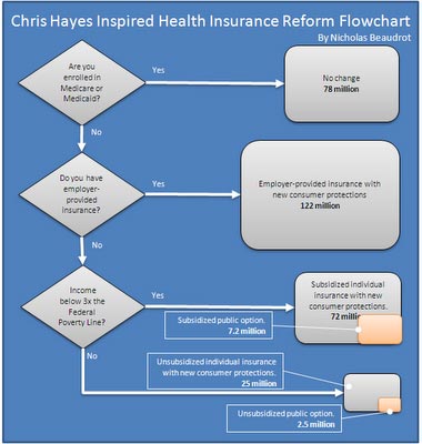
The flow chart above was created by Nicholas Beaudrot at Donkeylicious. Chris Hayes gave him the idea. I'm visually oriented as I think many people are. If you look this over carefully, you can begin to understand what the proposed health care reform might do for (or to) you.
It's not surprising that I wish the reform were in place today, since I reside in the lower right hand corner of the chart. Click on the picture for a larger image.
3 comments:
The flow chart is a great idea. People don't take time to understand the issue by reading lengthy articles and this makes it easy to understand.
(An aside: This is a plea for help. I e-mailed you yesterday, Jan, but don't think it went through. I notice you were able to post Ronnie's badge for Elders supporting health care reform. I have Blog Spot, too, and kept getting the message that the link was broken or had illegal characters. I tried copying the link, used cut and paste, copied it manually and nothing worked. Am I doing something wrong? My e-mail address is: darcostner@yahoo.com.)
Under the best case scenario, that is the passage of the House bill, H.R.3200, without too much weakening by the Senate, the public option won't be available until 2013 (which, aside from the human cost of four more years without insurance, smells like electoral blackmail to me).
Quite a few more people -- maybe you -- would qualify for Medicare by then.
Nell -- you are right. By the time a public option would kick in, if one survives when this round grinds to some sort of conclusion, I'll have gotten to Medicare.
If I can stay healthy 3 more years, I'll make it ... how many won't?
Post a Comment