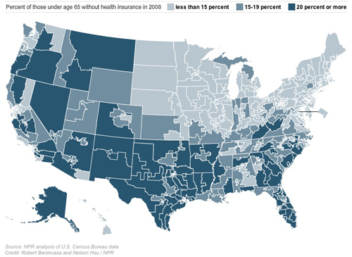
The Northeast, the Upper Midwest, and Northern California look better covered than the South and Southwest -- that is, these heavily Democratic areas are already places where most folks have insurance.
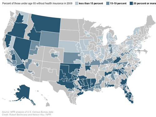
Now look at the map of the Republican-held districts:

There are some serious pockets where insurance isn't reaching people.
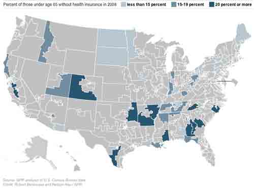
Now let's look at the districts held by Blue Dog Democrats, the Democrats mostly likely to be giving Nancy Pelosi trouble as she tries to round up House votes for health care reform.

It's hard not to draw the conclusion that many of the places that most need the combination of subsidies, new insurance markets in the exchanges, and new rules that are in the current bill are precisely those where Congresscritters are going to vote against reform. Curious.
Harold Pollack, who brought this to my attention, concludes:
The original NPR maps enable anyone to see the percentages of lack of insurance by district by mousing over particular Congressional districts.Americans who have the most to gain from activist government are often the very people most distrustful of such measures. In the short-run, these perceptions may cause problems come November and even come 2012. In the long-run, I believe this is an opportunity. Once health reform embeds itself within the fabric of American life, I'm betting that millions of Red-State Americans will not wish to see it go.
No comments:
Post a Comment