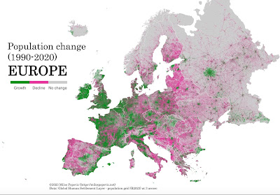
I collect these quasi-meaningful info-graphics. Sometimes they go with some topic on which I'm writing. Sometimes they just intrigue me. Busy today, so I'll just share a few:
 |
| Click to enlarge. The green areas are growing; the pink areas are losing population. |
In general, population growth signals a healthy economy. With freedom of movement across borders in the European Union, including to work, many people are clearly moving west. Nevertheless, when we walked the Camino half a decade ago, we saw plenty to indicate that the westerly Spanish countryside was emptying out.
 |
| Click to enlarge. Gerrymandering has its effects. |
I was surprised that Illinois (12.3 million) and New Jersey (9.2 million) were the most gerrymandered largish Democratic states. The monster ones, California and New York, have drawn congressional districts that give Republicans a chance; though Dems win most of their seats. Interesting too, that Louisiana and Alabama have been forced by the feds to give their Black population something like a chance to elect a few Congressmembers so they do not appear as rigged for Republicans as the rest of the South.
 |
| Click to enlarge |
In this moment, people in Pennsylvania who always vote have been trending more and more Democratic. As recently as 2018, the GOP leaners were more numerous in this subset of the electorate. Over the last three cycles, a broad coalition for Dems has formed and increased with each election. It's always important to bring new voters to a coalition, but bringing the existing base out has become central to getting a Democratic win.
Enjoy unpacking these.
No comments:
Post a Comment