 |
| Click to enlarge. |
I look at this informative map of COVID death densities from the New York Times and I see our US history of inequity and dispossession. Those very dark chunks in Arizona, New Mexico and Montana are traditional native lands, still largely the home of indigenous peoples. That dark smudge in Georgia is the old Black belt where formerly enslaved people still exist in rural poverty. The dark bits in South Texas are the home of impoverished Hispanics who found themselves on the Anglo side of a border imposed in the 1840s.
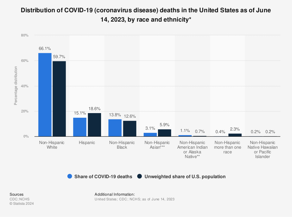
It's still a better deal to be white non-Hispanic, in this country, even though, since most of us are white, we have had the largest raw number of deaths:
Find more statistics at Statista
1 comment:
Are you reading the data correctly? According to your posted chart...
- Caucasians experienced 66% of deaths while accounting for 60% of the population.
- Meanwhile Hispanics fared far better with only 15% of deaths against 19% of the population.
- If this data is correct only one group, Native Americans fared substantially worse than Non-Hispanic Whites with a 1.1 to 0.7% ratio.
I would suspect the regions you pick out that are dark red do highlight the Native American toll, but trying to associate race with the other regions you mention is probably inaccurate. Those areas are indeed poor, but if the bar chart is correct those deaths were primarily Non-Hispanic Whites. Other media sources have noted the reluctance of heavily conservative areas to embrace masking and vaccination, you may be seeing those trends on the map. This would also explain the dark red swath right up through the plains states, areas that are primarily white.
Post a Comment