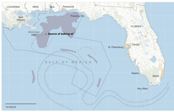
This graphic is from the New York Times interactive oil spill tracker. At the link, you can set the date back to the beginning of the disaster and watch the oil move.
As with developments in mile-deep undersea oil containment technology, showing the extent of the horror is evoking creativity in visual display of information.
No comments:
Post a Comment