All this used to be a lot more mysterious than it is today. No longer: there are fabulous tools available online to help people understand what the Census is doing and what the obstacles are. If you have even a little bit of demographic or electoral geek in you, you can spend hours playing with different possibilities at Census 2010: Mapping the Hard to Count Population. This amazing site is a project of the City University of New York's (CUNY) Mapping Service at the Center for Urban Research.
The census assigns every state, county, metro area, city and census tract a numerical score indicating how hard it is to count. "Hard to count" (HTC) is defined by the percentage of occupied households that did not mail back a survey in 2000 -- and also by variables that characterize the people who live there and how they live. Based on experience the Census has developed 12 variables that go along with difficulty getting a full count such as many households where people over 14 don't speak English, areas with crowded living conditions, or with a lot of people without high school diplomas. The Hard to Count website lets you display these variable on maps at many scales.
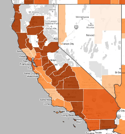
Here's the state of California, showing the HTC (progressively darker) areas, focusing on those with on the highest percentage of people receiving welfare or public assistance. Coastal Californians may be surprised to notice that, outside of Los Angeles, the areas worst hit by the recession and hence needing the most income support payments are far in the North and in the Central Valley.
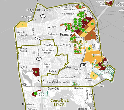
Zooming in, you can get maps that display all sorts of interesting data. Here we've got San Francisco with the boundaries of the two current Congressional districts superimposed, the hard to count areas areas where there are many renters colored in ascending shades of darker colors -- the green dots indicate the relative density of renters. Note also the diagonally green-shaded areas in the Bayview neighborhood and Daly City; in those areas, some 50 percent of mortgages are in danger of foreclosure.

You can zoom in further to the Census tract level. Here's the Mission district tract I live in. A pop-up includes links to all the numerical date that form the basis for the color coding on the maps.
The Hard to Count website is a geek and campaign organizer playground. Go ahead, check it out. Just allow lots of time ...
2 comments:
Wow. I'll pass this on.
Thanks for your post. Glad you like the site. Just a heads up that last week we added two features:
1) Real-time Twitter feed: The “Twitter” tab now displays a list of the latest Census-related tweets, and also shows them on the map. We hope this will help Census advocates find concerned citizens, reporters, nonprofits, and other social networkers who might want to help get the word out for the 2010 Census.
2) Area-specific info for downloading: When you click on the map and highlight a state, county, metro area, or tract, you'll see a download link in the "HTC Stats" window so you can access that data directly (in Excel and Open Document formats), not just view it.
Post a Comment