
I was a little surprised the other day to see that the Walgreens near my San Francisco Mission district home had this bursting out along its quarter-block side wall. Are we about to enter a new psychedelic season?
Here's the finished version, a day later:
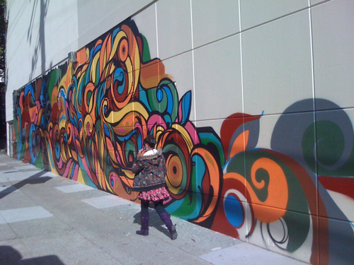
Interesting -- not exactly gripping. But hey, at least it probably won't get graffitied every night. Maybe.
This mural is in sharp contrast to the mural on the new Walgreens only five blocks away at the corner of Mission and Cezar Chavez Streets. That location was controversial to put it mildly. Community activists were arrested at the site trying to block bureaucratic approvals for the new structure; they wanted low income housing on the vacant lot. They lost. It is now a Walgreens topped by new condominiums.
But Walgreens did plant a mural on the side of the building. And it is in the neighborhood's signature (almost trite) style.

It's a tribute to farmworker organizer Cesar Chavez and Mission culture.

The iconic United Farm Workers Union eagle is prominent.
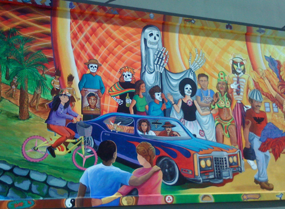
So are neighborhood low-riders and a mixed race couple. How hip! Note the funeral portrait of Cesar carried in the background.
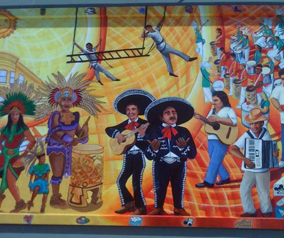
The mariachis and the Carneval drummer are as authentic as can be.
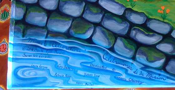
Neighborhood stalwarts from Precita Eyes Mural Arts Center got the job for this one. Good to see some of the development money staying local.
5 comments:
Fascinating mural survey. Abstract design may be the way of the future as our references change so quickly. Your close-ups of the second mural would be useful and probably deserve accompanying text.
But for me, affordable housing needs a higher priority. Annoying that corporations believe they buy off communities with these "gestures."
WalMart and Walgreen are going to own the cities in time. You can't drive a mile any direction without seeing a Walgreen Drug store. Money always wins.
Murals are very big in Mexico. These are reminiscent of the ones I saw in Mexico City.
"Almost trite"? I'd say it went all the way, though the colors are certainly pretty.
This seemed not entirely trite to me because some of the details are so apt. But yes, we have a lot of murals in this vein.
Seattle managed to get moderate income housing in a mixed-use development with Walgreen’s in 2007. Because I’m genetically unable to embed URLs, here’s the Cliff Notes version: the woman developing the property was going to develop only for a Walgreen’s. Community housing activists spoke up. A housing group got involved. Perhaps surprisingly, it was the developer who “helped convince Walgreens to partner with the Capitol Hill Housing Improvement Program to build multifamily housing on top of the Walgreens … instead of a one-story structure with a parking lot in front.”
“A great example of the power of persuasive citizens came when Walgreens proposed a standard store design on a corner street along 15th Avenue on Capitol Hill in Seattle. The area is composed of multi-storied condo and apartment buildings, so the Walgreens proposal was out of character with the present street design. Citizens got engaged early in the process and joined forces with Capitol Hill Housing to develop a plan along with Walgreens for 44 units of affordable housing apartments above the Walgreens storefront. Citizens searched for an alternative proposal based on their neighborhood values and were able to gather enough public support for the alternative consistent with compact development.”
Post a Comment